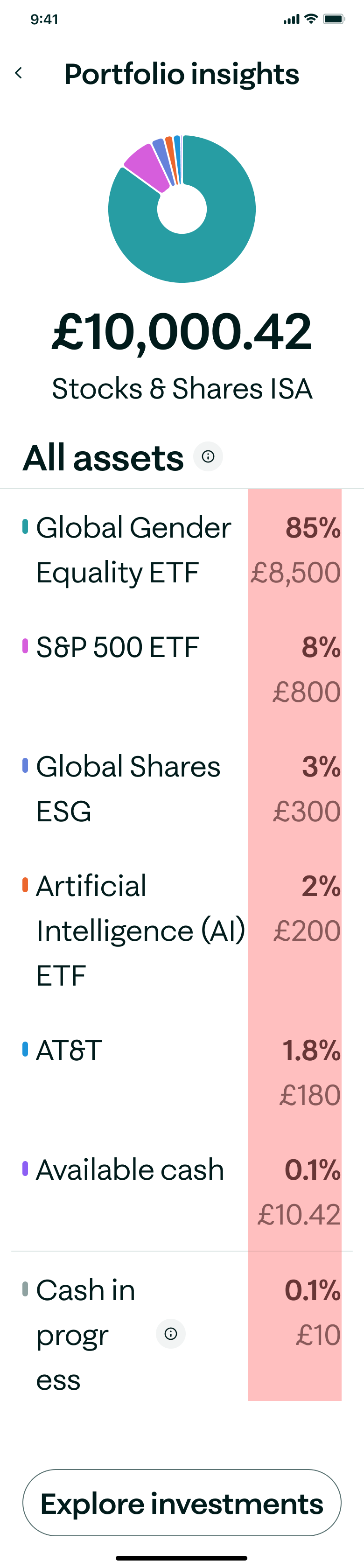
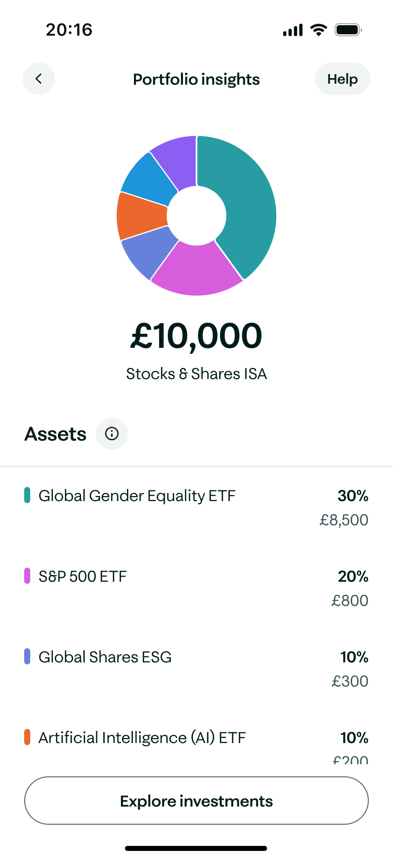
Portfolio Insights
Turn your money into something greater. A tool delivered as part of the Investing Spotlight campaign, to highlight to customers their portfolio breakdown across a range of categories (ESG, Geography, Sector, Class & Type).
The team

Research insight
Advanced investors were leaving Moneybox because the app lacked a consolidated view of their funds and equities needed to effectively track and control their portfolios.
Our Solution
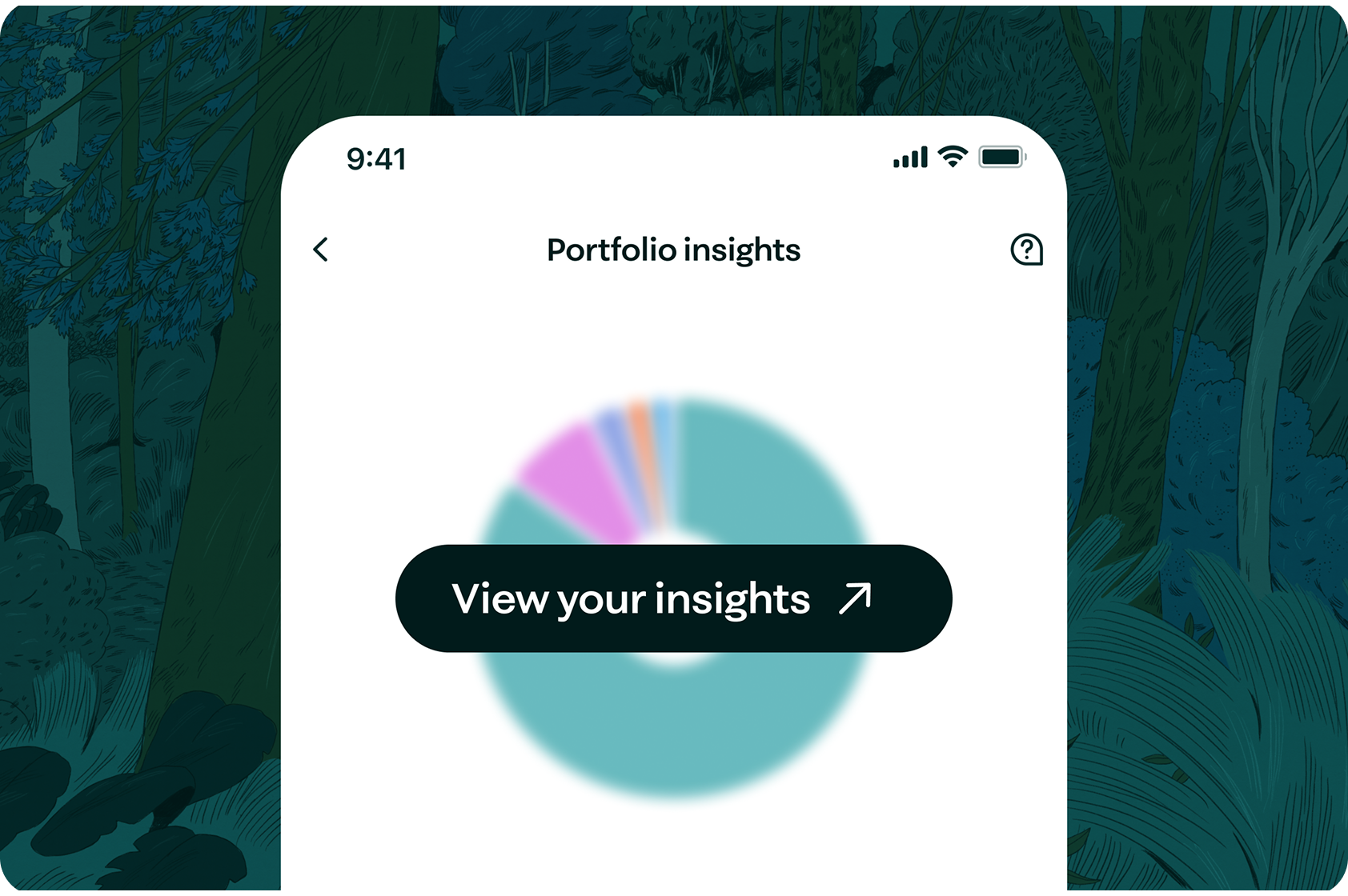
See where
your money is
View your portfolio split between accounts, equities & cash savings.
Background
The feature was launched as part of a wider investing campaign, September 2025, to add value for customers & to get UK savers into investing products.
The tech
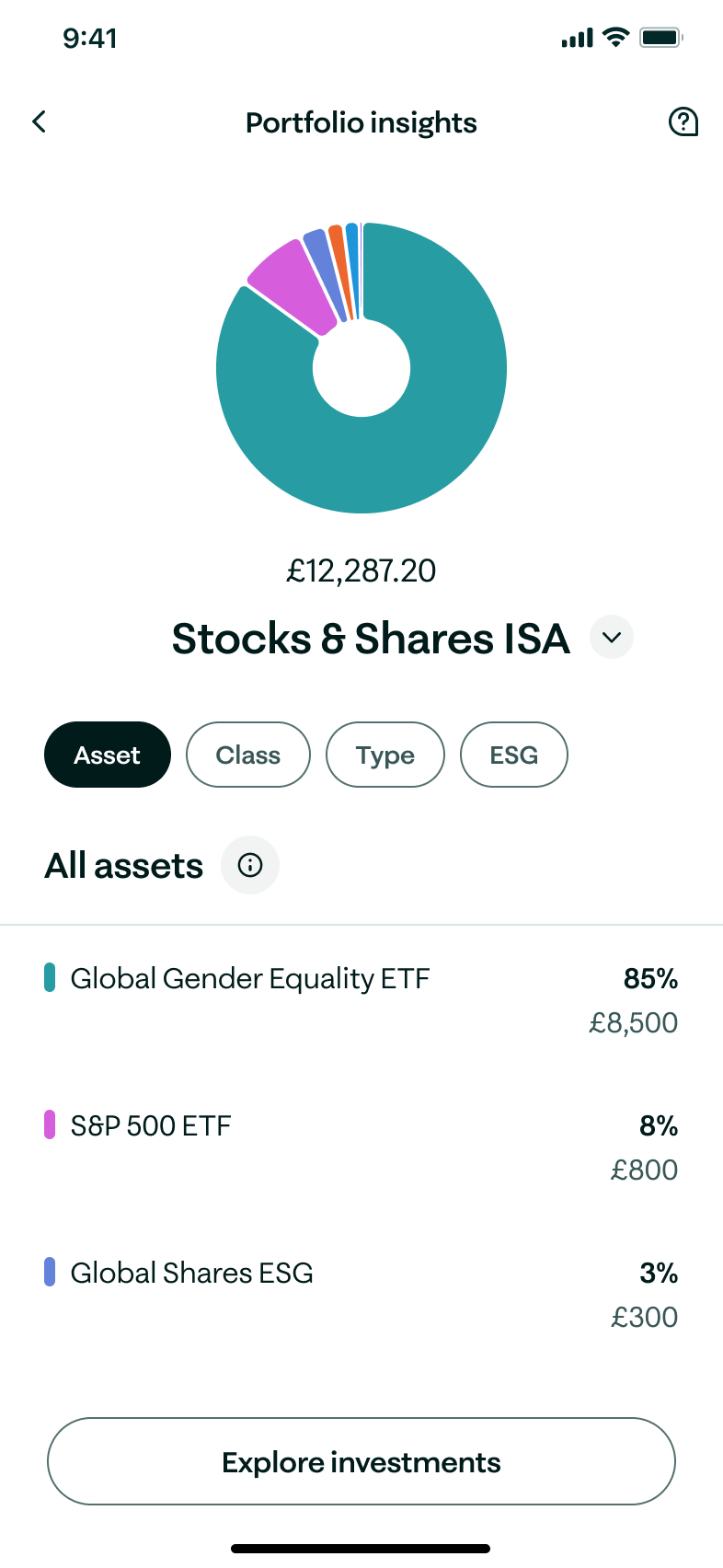
A templated screen to show users how their portfolio is divided per product and further by asset, class, type & ESG.
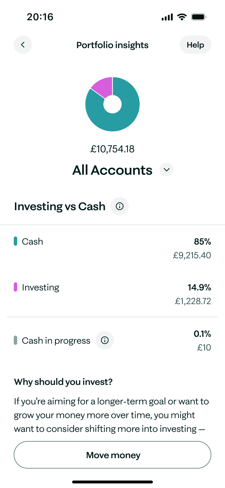
Wealth Mix
Get cash savers investing
A soft nudge to promote Cash ISA users to move more of their money into Stocks & Shares ISA accounts to support their long-term savings goals.
See the split of your Moneybox wealth between investing & cash accounts.

Results & Impact
-12% Transfers out
Fewer customers transferring their funds away from Moneybox after Portfolio Insights launched, indicating significantly improved portfolio confidence and reduced anxiety around investment management.
542+ views
Within the first month of launch, Portfolio Insights received 542+ unique views from active customers, demonstrating strong feature discoverability and organic engagement.
76 NPS
+5 since launchInvesting-specific NPS score following rollout, indicating customers found the portfolio breakdown genuinely insightful and useful in managing their long-term investment goals.
Product Insights
Investing breakdown
A soft nudge to promote Cash ISA users to move more of their money into Stocks & Shares ISA accounts to support their long-term savings goals.
See the split of your Moneybox wealth between investing & cash accounts.
Participant 7, Weekly App User
“The visual breakdown is super helpful. It’s clean and simple, not overwhelming at all, and I can tell at a single glance exactly how my portfolio is weighted without having to dig through dense financial reports.”
Contents
Contents
Designing for all users
Dynamic text
Adaptive to a users device settings up to a 200% text increase, in-line with WCAG AA.
Data Colours
Applied a scalable data colour set that is AA colour compliant.
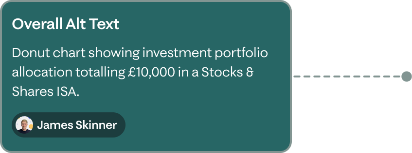
Read order & Alt text
Providing a clear read order and alt text for all interactive elements.
Jobs to be done
Bolstering the experience
To ingrain deep delight throughout the experience, we adopted the Jobs To Be Done framework to meet and look to exceed users expectations & needs.
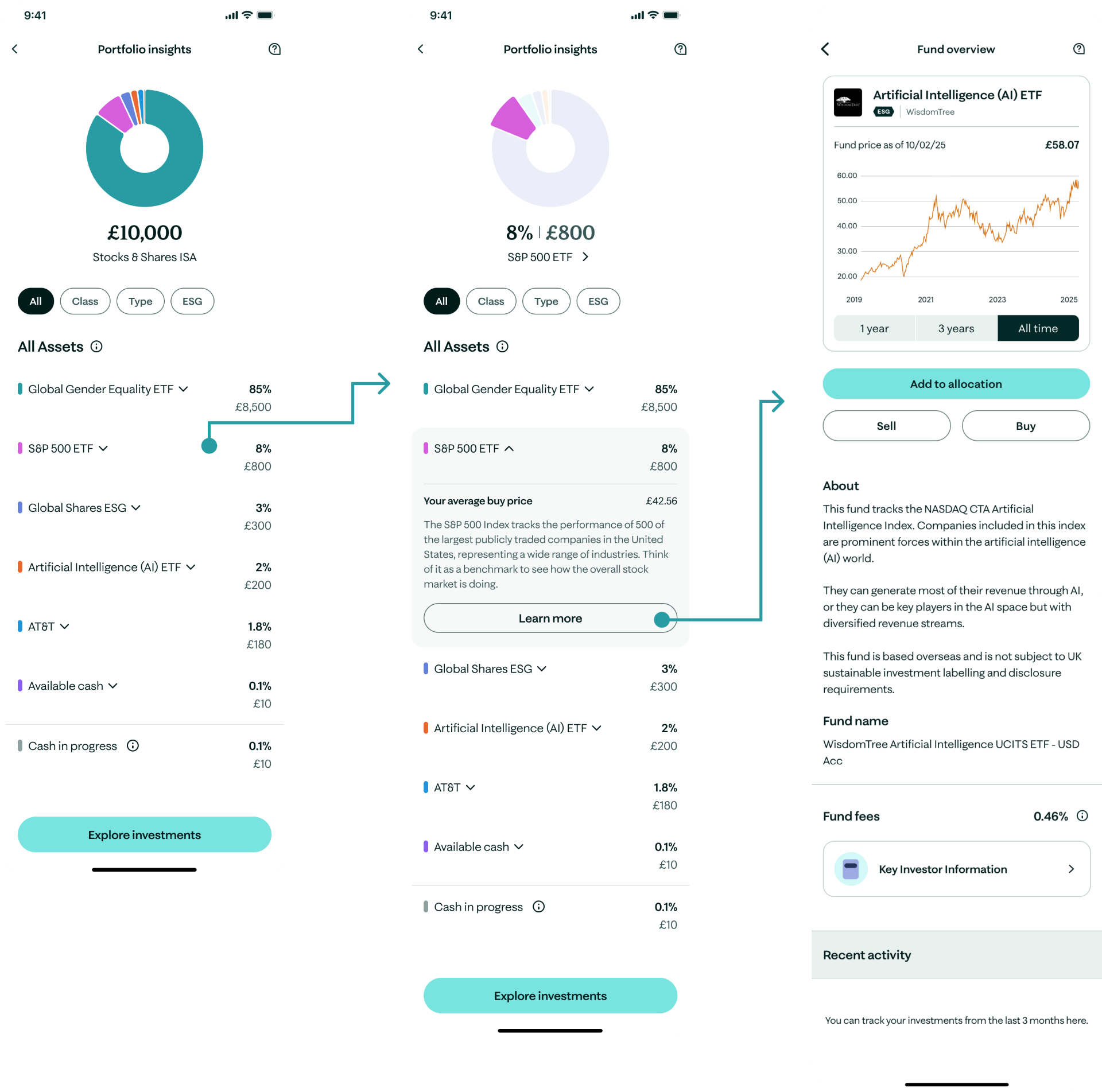
- When looking at S&S ISA, as a user I want to see where my money is invested.
- Then, I don’t recognise an ETF, so I want to view a quick summary & see my average buy price.
- Then I want to see how the fund has performed overtime.
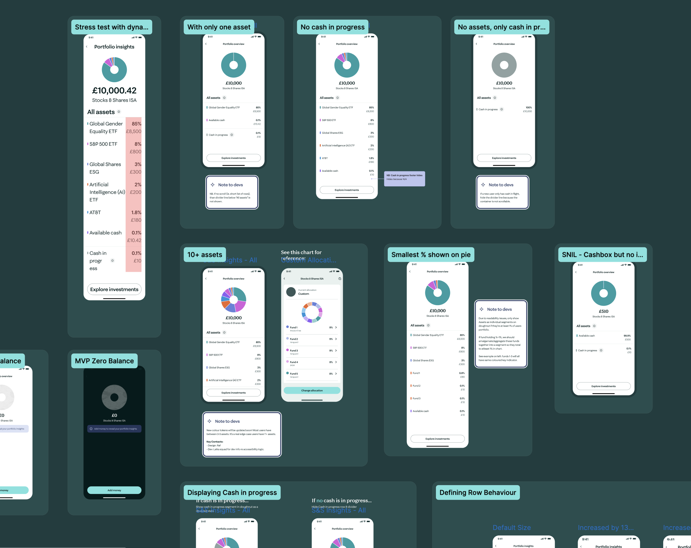
Design handover
Design to delivery
This project came with lots of technical challenges requiring a close dev-to-designer relationship on both the front-end & back-end. This was due to:
- Updates to the styling of our Design System components
- Bespoke components that required new behavioural definitions.

Evaluation
I’m very happy with the outcome with this project. I think we could continue to refine our accessibility adherence. I’d like to intro subtle textures so we’re less reliant on colour to communicate a user’s data.
What next?
We’ll be continuously monitoring the performance of the product by assessing it against product & business metrics such as:
- AUA
- Adoption of investing products
- Average #funds per user
- Session time
- CSAT & NPS