Promoting Storytelling
Designing a reusable component optimised for engagement through storytelling.
The team


Research insight
Users are scanning rather than reading, bypassing dense UI copy and missing critical information.
Background
To significantly reduce build times, Moneybox has heavily invested in server-driven UI, what is internally referred to as Blueprint. This approach allows screens to be delivered systematically by referencing existing design system components, eliminating the need for custom builds.
After rolling out Blueprint, we ran usability sessions across multiple touch points to see how the new flows performed in the wild. The qualitative data pointed to a single, glaring theme: our text density was simply too high. Users were consistently skipping the majority of the copy, telling us we needed to rethink our visual communication systematically.
Key Metrics
Informational overload directly led to user drop-off, lower feature comprehension, and an increased cognitive load during high-intent actions.
45%
Drop-off rate on Product Merch Blueprint screen
Overwhelming layouts and excessive text are creating immediate friction, causing users to abandon the Stocks & Shares ISA funnel during critical merchandising moments.
80%
of signed-up users failed to understand the T&Cs.
When we tested user comprehension of the existing blueprint screens for S&S ISA, only 20% fully understood our T&Cs.
5%
Decrease in conversion rate in Personal Pension xSell
Heavy cognitive load at critical decision points is stalling final signups and suppressing overall customer acquisition.

The problem
We’ve observed…
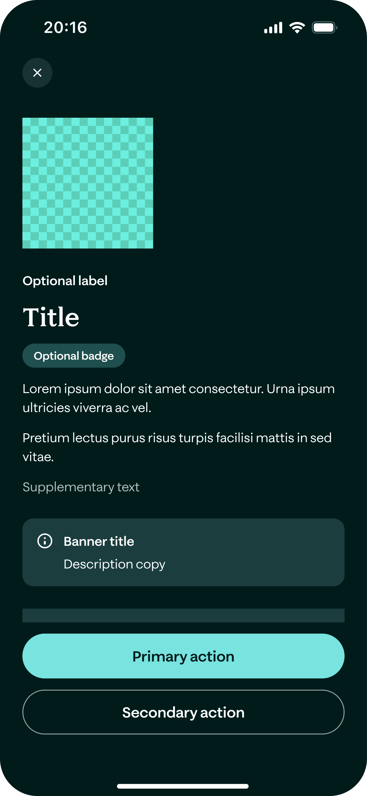
The Blueprint templates (pictured) have been a huge win; they’ve significantly boosted our productivity and helped us maintain great design consistency across the app. As we continue to use and evolve them, we’ve noticed a few areas where we can iterate to make the user experience even stronger.
Our project aims
To bolster engagement
Creating Visual Variety
While the conventional blueprint layout (asset + text block) has been incredibly efficient, it's resulted in some screens feeling a bit text-heavy and similar to one another. We've received some helpful feedback suggesting we explore ways to make the screens visually engaging to keep our users' attention and help prevent drop-off.
Enhancing Our Storytelling
We do a fantastic job keeping our language accessible, but we've noticed that sometimes the information can still come across as a dense list of features. Moving forward, we have a great opportunity to break up these larger text blocks and weave our content into more digestible, user-focused stories.
A Systemised Solution
Recently, a few different versions of carousels have naturally emerged across different teams. We wanted to consolidate & design a flexible, modular Page Carousel component for both iOS and Android, ensuring it could scale natively across the entire Moneybox ecosystem.

Design Principle
Billboard rule
Users don’t read; they scan. To hit them with the core benefits instantly, we borrowed a page from Uber’s playbook (contextual cards) and embraced the “Billboard Rule.” We keep text to an absolute minimum to ensure high visual impact. The ultimate test? If a user can’t grasp the screen in 3 seconds, it’s time to start cutting.
One simple message per screen:
- Title
- Sub-title
- Asset
The solution
A flexible carousel
We successfully launched a flexible Page Carousel component integrated into the Moneybox design system, enabling teams to break complex processes into bite-sized, visually engaging stories.
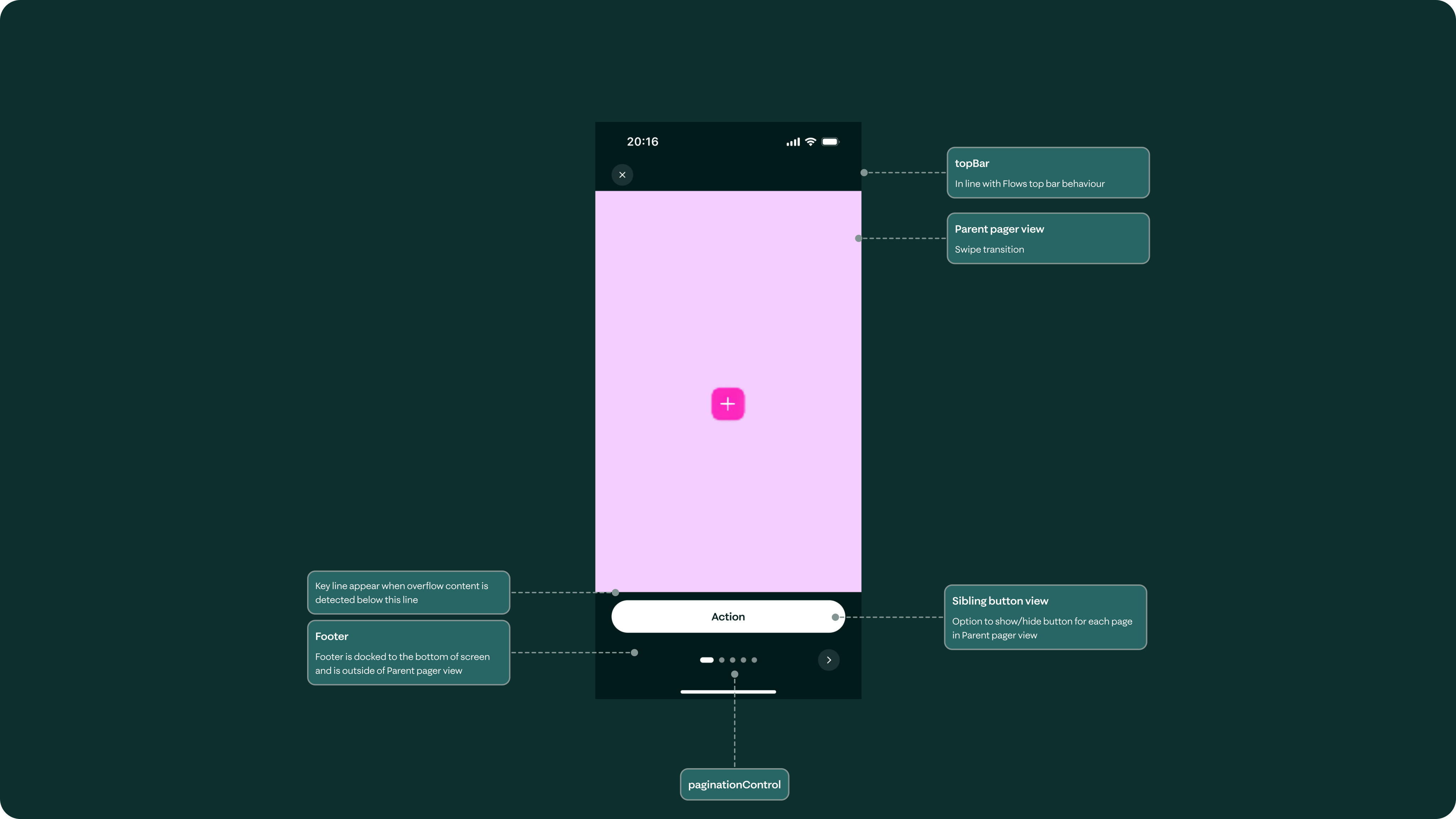
Configurable properties
- Number of pages (recommend 3-5)
- Show button on all/last page
- Page content view can house any number of Blueprint components
Impact & Implementation
Whilst the component has been built, it’s yet to be released. We are planning to launch A/B tests to measure the impact against our baseline 45% drop-off rate.
Minimised production
By engineering a drag-and-drop, CMS-driven template, we significantly reduced design and engineering cross-functional overhead, making the component entirely flexible for any future use case.
Enabled experimentation
Beyond immediate efficiency gains, designers gained a powerful, reusable UI pattern to experiment with different copy & image variants.
A systemised solution
Since the release, we've shifted away from Moneybox's traditional, feature-heavy product copy to experiment with emotionally resonant storytelling. By anchoring complex financial milestones in user aspirations rather than just technical specifications, we are designing a more empathetic narrative that connects deeply with customer motivations.
Example
In-app marketing
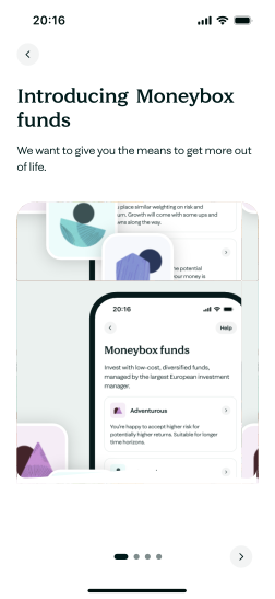
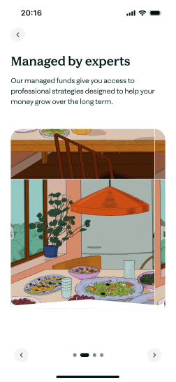
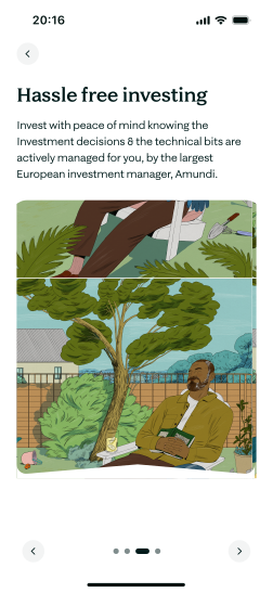
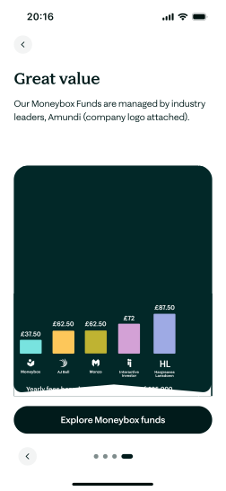
Primary objective: Increase conversion into our new Moneybox funds
A simple linear narrative to drive users anticipation towards a specific action.
Defining Gestures
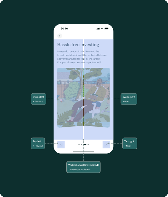
To ensure a seamless and accessible user experience, we defined the component's interactive regions. As illustrated, the layout supports 2-directional scroll, allowing users to transition between content blocks using either natural swipe gestures or explicit tap targets, alongside vertical scrolling for oversized layouts.
Catering for dynamic text
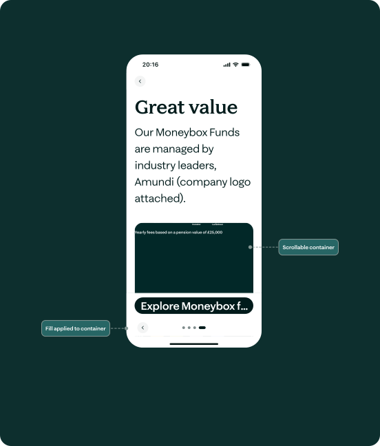
The template complies with WCAG guidelines by handling text at 200%. The containers fill to accommodate text wrapping and introduces vertical scroll when the content becomes oversized to preserve readability.
Adopting AI
Refining Page Transitions
To align stakeholders on motion design, I used Figma Make to build an interactive testing interface. By integrating custom control sliders, stakeholders could manipulate and refine the transition styling in real time, significantly streamlining the feedback process.
Adopting AI
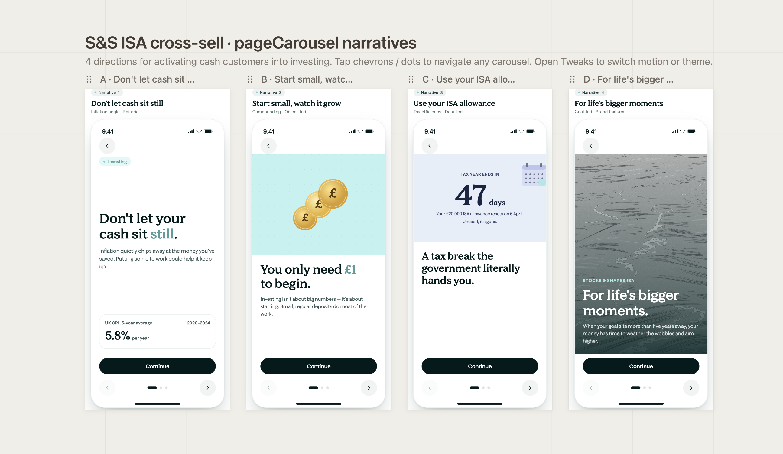
Tailoring our message per user segment
I used Claude design to ingest our segment research data from PowerBi and UXR files to help tailor our messaging per user to mitigate cash customers barriers to investing.
For instance, instead of generic ‘Start Investing’ copy, Claude helped us pivot to ‘Beat inflation with your cash’ for our low-risk segment 8 customers, directly addressing their specific financial anxieties.
Adopting AI
Spec'ing for Dev
I developed a shared Claude Skill to automate accessibility annotation for new components, saving designers at Moneybox at least 4 hours per project.


Reflection
Key takeaways
Systems Over Screens
Building a component is only half the battle; the real challenge is governance. We must actively partner with product teams to ensure the carousel remains an intentional storytelling tool, rather than a dumping ground for copy that should simply be cut.
Unlocking Cross-Selling:
While initially designed for onboarding, the framework doubles as high-converting pattern for feature discovery. Its format allows teams to seamlessly introduce products (e.g., driving cash customers to investing) without cluttering the core app experience.
Assets Dictates Success:
As this UI pattern is visually dominant, the carousel is only as good as the creative assets inside it. Success requires tight, ongoing collaboration with the Brand team to continuously raise our illustration standards.